


I am an entrepreneur who believes to build something more than just a business.
-
3 Articoli
-
2 Foto
-
0 Video
-
CEO alle MVP Empire
-
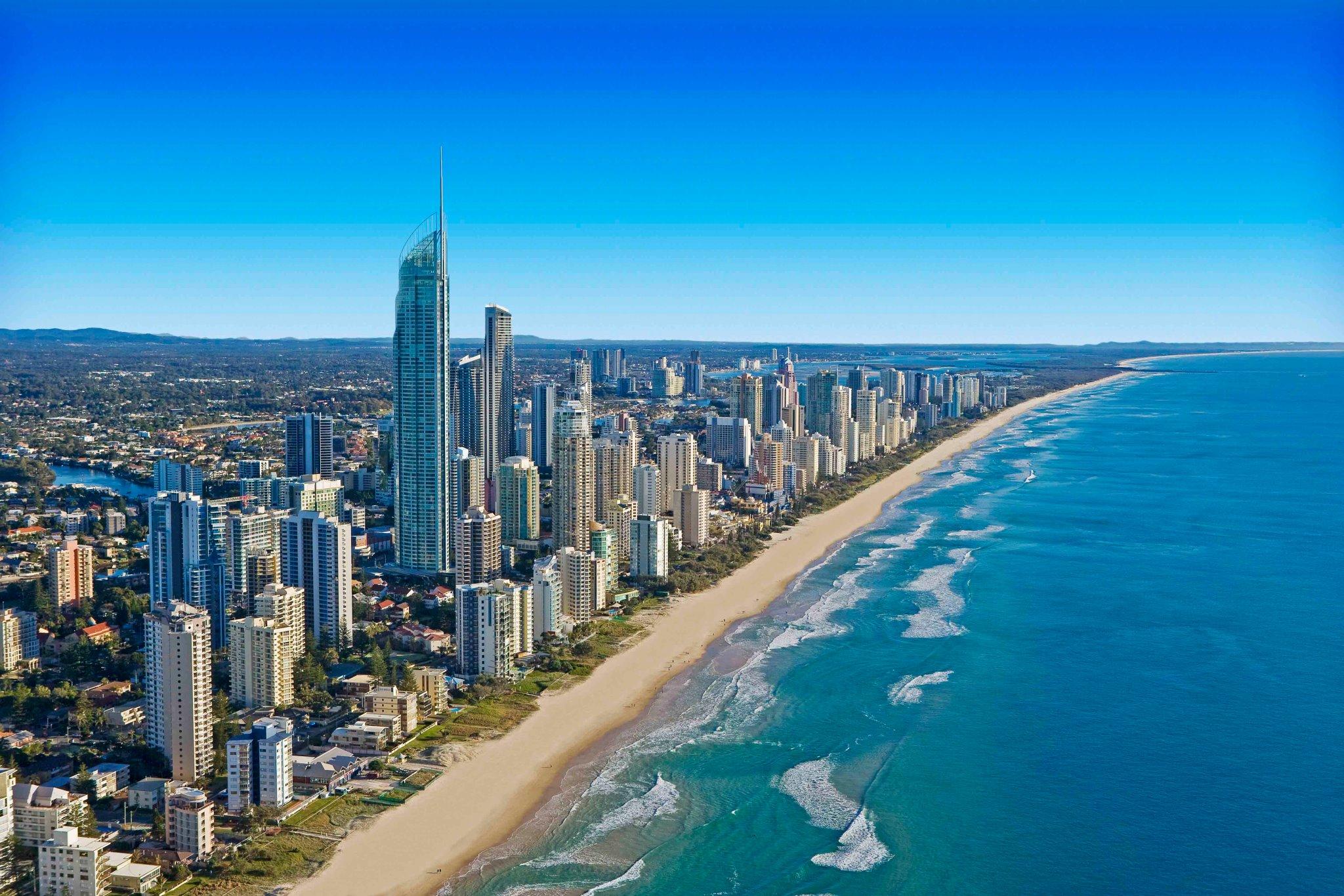
Vive a United States
-
Dal New Orleans, LA, USA
-
Ha studiato Business Administrator alle BUI University
-
Male
-
Sposato/a
-
03/11/1970
-
Seguito da 7 people
Cerca


Aggiornamenti recenti
-
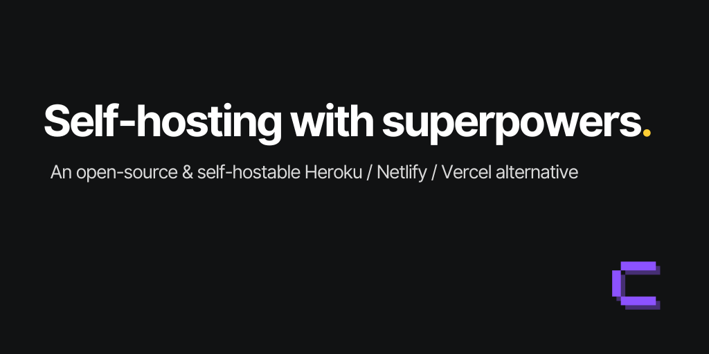
List of Places To Host Sites
https://coolify.io/
https://railway.com/
https://dokploy.com/
https://www.getampt.com/
https://seenode.com/
https://alchemy.run/
https://fly.io/
https://workers.cloudflare.com/
https://appwrite.io/
https://www.hostinger.com/web-apps-hosting
https://www.heroku.com/
https://xhost.live/
https://kuberns.com/
https://www.qovery.com/
https://northflank.com/
https://www.okteto.com/home/
https://coder.com/
https://www.signadot.com/
https://www.vcluster.com/
https://www.bunnyshell.com/
https://encore.dev/
https://dokku.com/
https://catalyst.zoho.com/slate/
https://sliplane.io/
https://planetscale.com/
https://supabase.com/
https://www.mongodb.com/products/platform/atlas-database
https://aws.amazon.com/lambda/List of Places To Host Sites https://coolify.io/ https://railway.com/ https://dokploy.com/ https://www.getampt.com/ https://seenode.com/ https://alchemy.run/ https://fly.io/ https://workers.cloudflare.com/ https://appwrite.io/ https://www.hostinger.com/web-apps-hosting https://www.heroku.com/ https://xhost.live/ https://kuberns.com/ https://www.qovery.com/ https://northflank.com/ https://www.okteto.com/home/ https://coder.com/ https://www.signadot.com/ https://www.vcluster.com/ https://www.bunnyshell.com/ https://encore.dev/ https://dokku.com/ https://catalyst.zoho.com/slate/ https://sliplane.io/ https://planetscale.com/ https://supabase.com/ https://www.mongodb.com/products/platform/atlas-database https://aws.amazon.com/lambda/0 Commenti 0 condivisioni 176 Views 0 Anteprima -
Palette of success - What brand colours are the best?
What are your experiences with choosing the colour for a brand or observing other logo colours? I want to know if you have noticed any patterns? Do you agree with the importance of colour or is the messaging more important?
I would say personal and cultural factors determine them for the most part, so you can’t really be lazy by looking at a picture on the internet containing a simplified classification of the function of different colours and using it thinking you now know it all about colour psychology. You have to keep in mind what emotions you want your audience to feel towards your brand’s personality. The colour you choose may correspond to a general characteristic, but it’s more important that it fits your brand’s personality and gives you an unforgettable look. The notion that green, for example, is a colour of calmness and nature may be known by most people, but that hasn’t stopped a company like Monster Energy which is associated with sports and…well…energy, use it. Yet the colour fits perfectly.
On the other hand common colour associations DO exist, and admittedly, becoming familiar with the colours that affect most people’s perceptions in a mostly similar way is actually a great starting step. So I’ll give a quick guide and hopefully this thread will be a place to gather more opinions and examples regarding colour psychology and colour choices!
SO in general, we can say:
- Red: can affect your physical body and increase your blood pressure AND appetite. This is the colour of passion and danger, so it’s appropriate for different products from inviting food at McDonalds to speedy cars.
- Green: of course, the colour of nature, growth, freshness, and calmness. Think: Wholefoods, Starbucks. But as previously said it doesn’t have to solely represent that. Think about Spotify, it uses green to convey the healing, cheerful state of listening to music.
- Even more calming than green is blue, think again of nature but this time the sea and the sky. That’s why blue is so powerful. It is also an indicator of intelligence, trust, and security. Next time you see the Boeing or Visa logos, remember they are trying to gain your trust by their colour.
- Yellow: is associated with youth, sunshine, and happiness. All is good. On the other hand, it also has a connotation for caution as seen in road signs.
- Orange: also has a great range. Think of Nickelodeon to remember the joyful, entertaining vibe it exudes. Then think about the many supermarket chains that use it to show they have cheap and affordable products!
- White & Black: These are real double-edged swords. They are pretty hard to execute, and once done poorly can either bore the customer or make them feel purely miserable. Once done nicely, though, they’re a clear sign of modernity and luxury.
Looking forward to more discussion about this!Palette of success - What brand colours are the best? What are your experiences with choosing the colour for a brand or observing other logo colours? I want to know if you have noticed any patterns? Do you agree with the importance of colour or is the messaging more important? I would say personal and cultural factors determine them for the most part, so you can’t really be lazy by looking at a picture on the internet containing a simplified classification of the function of different colours and using it thinking you now know it all about colour psychology. You have to keep in mind what emotions you want your audience to feel towards your brand’s personality. The colour you choose may correspond to a general characteristic, but it’s more important that it fits your brand’s personality and gives you an unforgettable look. The notion that green, for example, is a colour of calmness and nature may be known by most people, but that hasn’t stopped a company like Monster Energy which is associated with sports and…well…energy, use it. Yet the colour fits perfectly. On the other hand common colour associations DO exist, and admittedly, becoming familiar with the colours that affect most people’s perceptions in a mostly similar way is actually a great starting step. So I’ll give a quick guide and hopefully this thread will be a place to gather more opinions and examples regarding colour psychology and colour choices! SO in general, we can say: - Red: can affect your physical body and increase your blood pressure AND appetite. This is the colour of passion and danger, so it’s appropriate for different products from inviting food at McDonalds to speedy cars. - Green: of course, the colour of nature, growth, freshness, and calmness. Think: Wholefoods, Starbucks. But as previously said it doesn’t have to solely represent that. Think about Spotify, it uses green to convey the healing, cheerful state of listening to music. - Even more calming than green is blue, think again of nature but this time the sea and the sky. That’s why blue is so powerful. It is also an indicator of intelligence, trust, and security. Next time you see the Boeing or Visa logos, remember they are trying to gain your trust by their colour. - Yellow: is associated with youth, sunshine, and happiness. All is good. On the other hand, it also has a connotation for caution as seen in road signs. - Orange: also has a great range. Think of Nickelodeon to remember the joyful, entertaining vibe it exudes. Then think about the many supermarket chains that use it to show they have cheap and affordable products! - White & Black: These are real double-edged swords. They are pretty hard to execute, and once done poorly can either bore the customer or make them feel purely miserable. Once done nicely, though, they’re a clear sign of modernity and luxury. Looking forward to more discussion about this!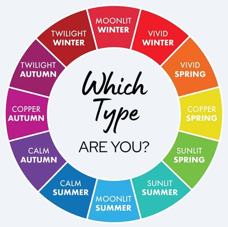 0 Commenti 0 condivisioni 1K Views 0 Anteprima
Altre storie